|
1.2. Cut down the percentage of physically depreciated and obsolete buildings by demolition of 3.5 millions square kilometers of 5-storeyed panel houses (series K-7, P-32, P-35, 1-MG-300, 1605 AM) for the safety of the population. 1.3. Reconstruction of 5-storeyed residential quarters by city planning and building of functional complexes and modernization of 1.0 million square kilometers of the existing houses (series 1-515, 1-510, 1-511, 1-447 and the equated) along with demolition of dilapidated buildings. |
Making of panoramic images for Federation Tower website. Part Four
Part One Part Two Part Three Part Four
|
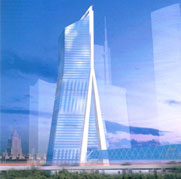
We are finally to vision Moscow in a hundred years. When the work was just starting all the studio designers received a home assignment (as usual, for the week end)—“Moscow one hundred years later.” Monday all gathered according to the tradition at the “wailing wall.” The subject is unfathomable, to my regret—everyone had took his own approach and none had to do with Moscow City Center. Yet still, there has to be something changing on the image as a hundred years go by. Ilya Mikhailov had an idea that in 50 years we could unbuild one half of Eurasia Tower and place a golf course there: “It blocks the panoramic view!” I rejected it the whole time saying it was pointless. Vandalism! Disgraceful! Costly! Ridiculous! And so on. Cut down to half Eurasia Tower began looking like a stub and caused us trouble in some kind of revenge. Firstly, the stump was spoiling the composition; secondly, we now could see the part of the view that was well obstructed by the tower for 40 preceding years. We had to take pains to bring back the harmony.  |
|
I suggested that we should extend vector-active structures off Terminal complex to create a carcass for the course. It would conceal the stump and unite Eurasia with Terminal. Additional space inside these structures could be used for storing the equipment or taking walk to enjoy the city view. The golf course itself ended up looking like a huge footprint.

Once we got over Eurasia, we had to deal with Moscow.

Artist— Petr Pan. Illustration from “Moscow. Losses” by Sergey Romanuk, 1992
I am not a Muscovite. For orientation and to limit the number of variants I had to study the general plan of development of Moscow to 2020.

Examining the city structure using the maps enclosed with the general plan is, I must tell you, quite an experience! I believe Predator from the famous movie felt the same when he switched his vision modes.
Anyways, they plan to build 60 skyscrapers, 12 of which appeared in the previous part of my story. We’ve fitted only 9 of them into the panorama.
On this photo (residential district) I found 4 construction sites:

In the third part of the general plan of development of Moscow we read:
Then, I marked green what becomes most dull with the new modern buildings around:


If we take a look at the general scheme of Moscow planning and zoning, just among the low-rise buildings of no more than 15 meters we will discover these two jumbos that are obviously more than 35 meters high:

And as the other riverbank didn’t use to have any skyscrapers as well, it would be reasonable to somewhat raise the level of this standard developed site. It would benefit the skyscrapers appearance on the one hand and create new housing on the other.
Marked in red is Kutuzovsky avenue (leading to the historic city center):

|
The avenue is also an exemplary gallery of state architecture praising Soviet achievements. Here we can see houses built in the 1930s and the Stalin-era monumental buildings of the 40s and 50s along with relatively modest constructions dating to the times of Khrushchev and Brezhnev. Nonetheless, they are all impressive and monumental. New City Agency. Historical and architectural reviews, Kutuzovsky avenue district. |
Something to show my grandchildren.
To be on the safe side, I rechecked what is there now and what is planned to be built.

One of the pieces we’ve been exchanging with Ilya Mikhailov while working on the project
Amusingly, no matter what new constructions appear Moscow stays recognizable with its high-rise buildings.
For example, looking at this skyline, however rearranged, we may never be sure it’s Moscow:

It is totally different when we have this:

At the beginning we could see three high-rise buildings on the panorama: Ukraina Hotel, the building of Russian Ministry of Foreign Affairs and Moscow State University. In our case Moscow City Center obstructs all the representative Moscow towers. At this point I very luckily came across a coin with 1980 Olympic Games emblem.

Now, we choose location like they do that for large shopping centers and erect the Olimpiada-80 building close to Luzhniki stadium.

Doesn’t this look like Moscow?
To keep the spirit up we build another two skyscrapers to the sides that have vertical knitted Adidas-like stripes.
The composition called for another building to gain balance.

Modern structures were lacking national tint, so that’s what had to be added.

All else seen on the horizon serves for demonstrating economic development and civilizational progress. However, it may well happen so that the growth of Moscow, which expands in circles, will result in crystallization of architectural groups in the very heart.
Here is a fragment of Moscow priority planning program, clause 2 on community services:
|
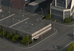
The program envisions the following community services: [bla-bla-bla] 2.9. Building automobile facilities including parking garages providing 425 thousands lots for parking individual vehicles. |
In the left bottom corner we see just such facility.

|

|

|
||
|
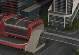
Some automobile service center |
According to the plan, there is another skyscraper (393 meters) to be built in front of Federation Tower (site 16), but for us it would block both Federation and Eurasia |
By 2030 all that is left of this skyscraper is a bridge through some other service center |
This, supposedly, is the mini metro that we found on the development plan of rapid offstreet transport.

By the way, what changes would the transport undergo and whether there would be flying cars still remained unclear. We asked Timur Burbaev to help us out. Here are some of the sketches he made:

Then, it got dark and we had to turn on the street lamps and some lights in the windows.
On the scheme called “Saving and regeneration of historical and cultural realty heritage of Moscow” I notice that Moscow City is located not far from Studenec mansion.

It’s a very Russian name, a gentle word that gives a frosty feeling (it comes from a synonym of frost in Russian). This inspired me to use winter frost patters for the night-time lighting of the tower.

It’s all fine, but it’s yet to figure how it could be realized.
The very first thing to do is to have the windows lit.
I created window masks:

Then took hold of a photograph of a skyscraper at night, made the windows face front, got rid of all constructions and prepared a texture with all compartments lit up:

Now I turn on the lights:

Street lamps go next:

And it’s almost done. I even put a 20-meter robot sturgeon into the river-let tourists have their fun.

There are all in all only 10 images, but there’s nobody but me alone and I’m already #*@ sick of it.
So it was Pavel Chistyakov who took over to finish the panoramas. The tremendous rain shower in the 2070s, doubling highways and the glamorous night sky of the early 22 century all belong to him. In the end, just before we released it, I actually did manage to pull the glitter onto the skyscrapers.

Afterwards, when it was already published, I came to realize that we had forgotten about the essence—we didn’t put people in there.
And now we only have to wait a hundred years to look back and smile at what we’ve pictured here.

